Client: Tall Paul’s Pickles
Location: Ann Arbor, Michigan
Project: Logo Design
I had a client named Paul. This guy was very tall and loved pickles. When he decided to jar his own spicy pickles, the product practically named itself.
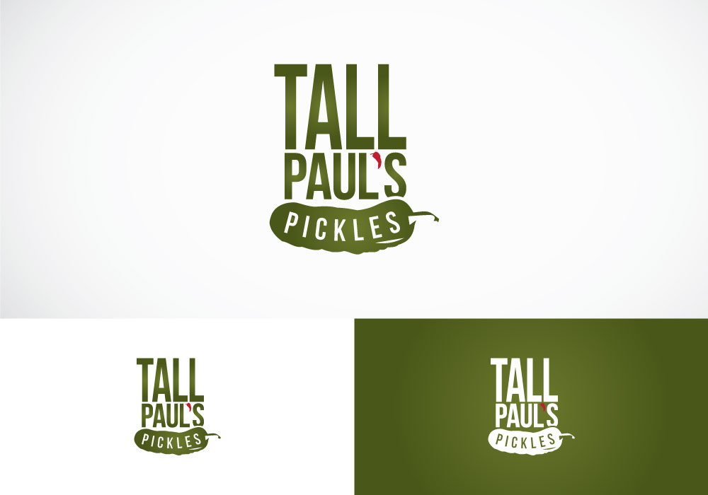
With a name like Tall Paul’s Pickles, they wanted a logo that had a bit of personality and a fun-factor to it.
I added some height to the word “tall” for obvious reason, utilized a pepper as the apostrophe (symbolizing the spicy nature of the pickled product) and reversed out the word pickles over a shape of a pickle… making sure the viewer knew exactly what was in the jar.
The resulting logo design helped the company make a splash in the grocery aisles with this very memorable brand.


