Client: Nutrition Connection Consulting Services
Location: Detroit, Michigan
Project: Logo Design
Nutrition Connection offers consulting services for diabetes education providing staff in-services to home care agencies, facilitating group nutrition classes, and assisting non-profits agencies in their health promotion programs.
The client wanted their new logo to show a sense of personal touch and caring. They also planned on using a tagline of “Connecting the Dots”.
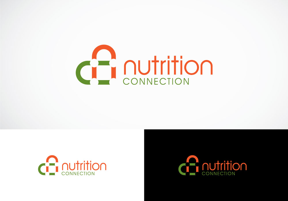
In this logo design, the letters “n” and “c” intersect to form a heart (representing their caring process). At the letters’ intersections, four dots are formed and are connected by the heart shape (playing on their ‘connecting the dots’ tagline).
The lowercase letters give off a more friendly and less corporate feel. The color theme is also warm and inviting.


