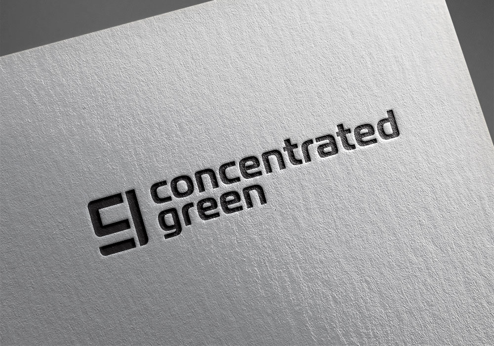
My client was looking to get into the high-end cannabis consumer market and wanted something clean and modern that could go on small packages. They were trying to find ways to identify as a brand versus a commodity to give consumers a reason to pick their product.
A designed a bold, unique mark that is formed from the merging of a “c” and a “g”. The logo design can be reduced in size and shown in one color without losing any of its detail.


