Client: See Jane Curse
Project: Logo Design
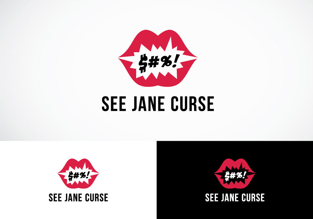
See Jane Curse is a blog covering the journey of mommy-hood, growing up and just being a female in this crazy world. Its content is a little edgy, hence the name, but the client wanted the logo design to be “feminine while a little rough… not too cutesy but still convey a sense of femininity and humor”.
With a name like See Jane Curse, the logo was “screaming” to be dynamic and fun. This design brings the name to life by showing a jagged-edged dialogue bubble with cursing characters reversed out on the silhouette of a woman’s pursed, red lips.


